
by Vid Warren
People do not generally go out with the specific purpose of networking; it is something so important that you'll need to be prepared to fit it into anything and everything that you do. To be ready to network, you'll need enough inter-personal skills to get by and enough organization to at least look like you're prepared for whom you might meet.
The challenge of appearing prepared is easy enough if you can second guess what people might ask of you. For example, contact information will be requested more often than a demo. Also, if you've just met somebody that works in the industry, you might not have enough time, there and then, to convince them that your music and musical services can be useful to them. If you can exchange details, you will be empowered with more time to concoct a convincing e-mail or phone call tailored to the circumstances. Similarly, people will want different, specific things from you depending on what they do.

A business card should encompass all relevant, non-personal forms of contact. It works on any level. I.e. no matter whether somebody wants to come to your next gig, write some music with you, book you for a gig, or sign you to an agency, a business card will give them the contact information they need. With something as versatile and compact, there's no excuse for failing to have these to hand at all times.

Although contact information is the most important part of your card, presentation can determine the way that someone views your status. Aside from aesthetics, there is a more business based focus on the use of images within a card; namely, branding. A subtle backdrop allows your card to further adhere to your colour scheme (even if that scheme is black and white). A logo or motif creates a brand association allowing for instant recognition on flyers, T-shirts, videos etc.
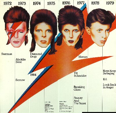
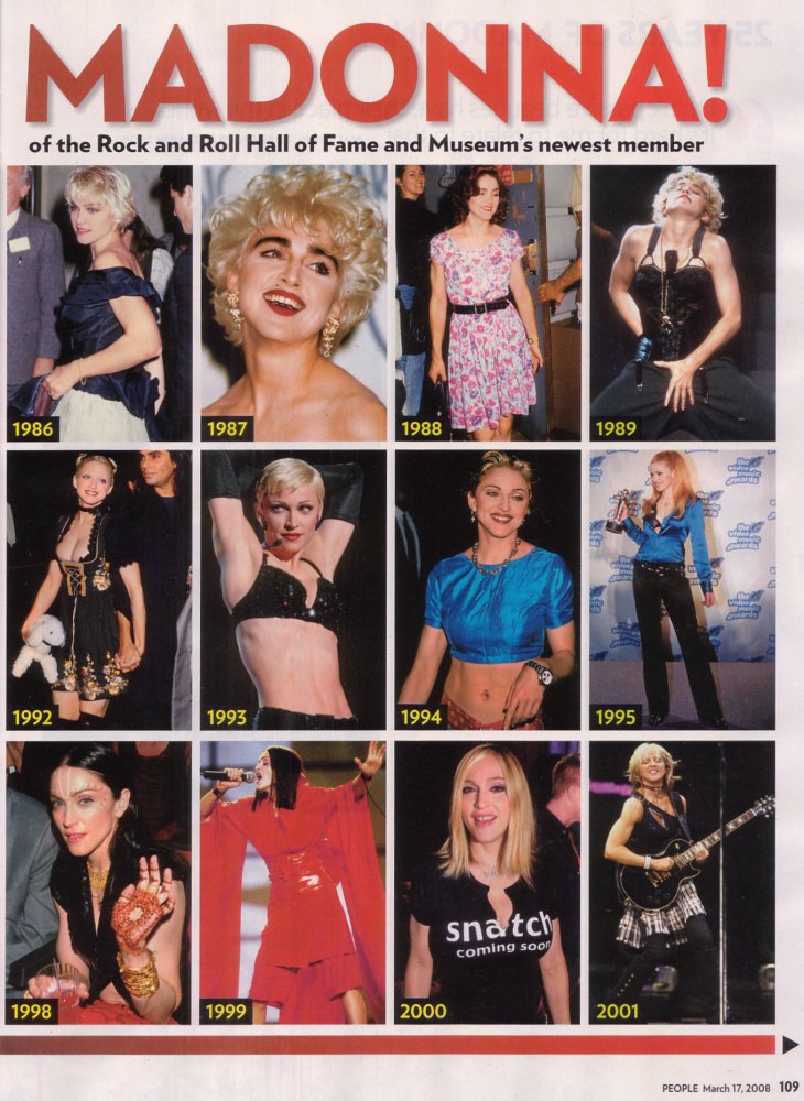
Creativity is synonymous with thinking outside of the box. Branding is, in a way, putting everything into a box. Thus, branding tends not to be popular with creative people. In a way, it's like reading a book after seeing the film; you're telling your audience part of their perception. However, give a minute to hear the other side of the argument: Image is considered as very important by most of your customers and, therefore, more so by your business associates. You can avoid being tied down to one image. Once you've established enough recognition, you can change your image, subtly or entirely and move on through whole new styles of music. That's how most of the longest standing artists have maintained public interest. Look at David Bowie, Madonna, Pink Floyd etc.
I believe that, if your music has depth, somebody will hate it no matter how 'good' it is. They'll probably have the potential to like it, but they won't. Changing your style allows you to reach more people throughout your career. Discovering an initial style helps make you, as an artist/band, into a complete package, at the very least, from the point of view of potential business associates.
It's up to you and you may not want to be in the 'public eye' anyway. Whether you adhere to a colour scheme or not, images can brighten up your card.
Giving somebody a business card is a step towards an exchange of contact details. You have given somebody several ways to get in contact and this will make it easier to ask for and receive the same from them. If they don't have a business card, you can ask for a number with less chance of getting fobbed off with an e-mail address.
What to include

Your business card is primarily for contact information; if nobody can read your details, it really won't matter how fancy your card looks.
The crucial details are:
- Phone number – Mobile is best; you're going to look a bit less pro if your mum answers when an A&R scout rings.
- Website – If you don't already have your own, I highly recommend buying a domain name and redirecting it to a website hosted by somebody else (e.g. a Myspace). This way, if you get a new website, or if large numbers of people stop using the site that hosts your current site, you can use the same domain name by changing where it redirects. Therefore, information on your card still stands and anyone you've already given your card to will need not be notified. To buy a domain name, do a search for “domain name” on the internet. You can get a “.com” for around £9 per year and a “.co.uk” for around £3 per year. Shop around. Practical uses aside, it looks more professional.
- E-mail address – When you own a domain name, you can set it so that e-mails sent to “[email protected]” will be forwarded to an e-mail address of your choice. From most e-mail accounts, it is possible to set it so that your mail gets sent from “[email protected]”. You can therefore put a professional looking e-mail address on your card and you can redirect if your e-mail address changes.
Aside from that, you'll need to consider whether it's worth putting a work address on the card. This depends, mostly, on how much of your business involves people coming to your work. For example, if you own or rent a studio, or if you're an artist in residency, it will probably be worth putting it on.
Being the most important part of the card, the contact information needs to be clear and will work best if everything is together. It is not uncommon to put 'M', 'E', and 'W' by your mobile-number, e-mail and website. Alternatively, people often put little symbols, such as tiny mobile phones, next to separate items of contact information. This is all optional and it all depends on what suits your card.
You will also need to include your name or at least your stage name. Seem obvious? You'd be surprised at how many bands put only their band name on their card. It's OK to put your personal stage name as a solo artist but what are people going to say on the phone to you as a band member when they have forgotten your name? “Hi is that...(your band name)?” If you make it difficult for somebody else, you're really making it difficult for yourself. How you present your name depends on your circumstance. If you're a solo act, have it in large letters as a motif, especially if it's a stage name. If you're part of a band and/or there is somebody else's contact information on the card, make it more subtle and focus on the band/company name.
Other than name and contact info, a little tag line or slogan helps give your card a little bit of personality. Information on what you do is essential for letting people know that you are skilled in many ways. A subtle backdrop or strong logo can also make your card more memorable and pleasant. A picture of you may be appropriate to stick in people's minds. Lines and squares can be used to divide up the different parts of your card and bring it order. Finally, leave some space.
Designing your card
This tutorial will explain how to create a professional standard business card using free, open-source software called GIMP. Feel free to try it with any other software.
To download GIMP, go to: http://www.gimp.org/ and choose the latest version that does not say 'development release'. It will work on Linux, Windows XP/Vista, Mac OS X, OpenSolaris and FreeBSD.
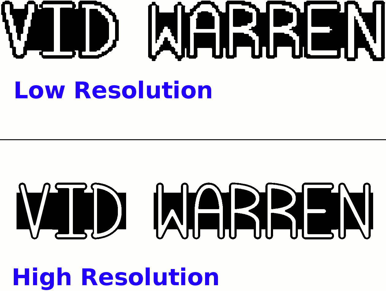
Once installed, open GIMP and, in the main window, go to – 'File', 'New'. Now click the plus sign by 'Advanced Options'. Set both the X and Y Resolutions to 300.00 pixels/in (lower resolutions look pixelated, higher resolutions have massive file sizes and some printing companies won't print them).
There is a drop down menu under 'image size'. Set it to millimetres and choose your dimensions. The standard for dimensions differs in different countries but 85mm by 55mm is usually a good bet (roughly credit card size). Click OK. You now have a blank canvas.
Before doing anything, it's good to understand how colour works in GIMP

Double click on one of the squares of colour at the bottom of your toolbox. You'll be presented with a column of letters: HSVRGB. These stand for the following:
- Hue – where in the 'rainbow' colour spectrum the colour is
- Saturation – How bright/dull the colour is
- Value – How light/dark the colour is
- Red, Green, Blue – How much of each of these colours is in the colour
Use these to choose the perfect colours for your card, consider whether they have any relevance to colour schemes on your website/Myspace/album cover etc. This scheme can be worked into an image of yourself that you are creating, (see the previous section of this article on purpose).
Quick Tip: There are several keyboard shortcuts in GIMP but they differ on different systems. When instructed in this tutorial to go through the menu, look out for these shortcuts to make things much easier.
On this particular canvas window, you're going to handle only the foreground part of your card such as text. For a wide range of fonts, you can paste the text in from other programmes such as paint. You may need to make this text much bigger before pasting it in as you're now working in a high resolution. Alternatively, you can create the text in GIMP with the text tool (the black 'A' in your toolbox), or both.
One crucial thing to explain: GIMP works in layers, The background will be a layer as will anything that is 'floating' (something selected that you can move around). Any GIMP text will also be a separate layer. This is so that you can come back and edit it later. The problem with this is that, once you have created text, it 'hovers', which limits what else you can do at the same time. To tackle this, once an item of text is complete and in place, go to 'Layers' (at the top of this image's window). Now click on 'Merge Down'. This will merge the selected text layer and the background layer into one.
At the bottom of all of these layers is what is called alpha. This is transparent and is represented by checkered light and dark grey squares. If, at any point, you see the alpha channel, you can use the 'Bucket Fill' tool, (in your toolbox), to fill it up. GIMP explains these layers in a tip:
"GIMP uses layers to let you organise your image. Think of them as a stack of slides or filters, such that looking through them you see a composite of their contents."
Create all the text. You may wish to use a motif for your name/band name. A motif is similar to a logo but it incorporates your name. Now use the 'Rectangle Select' tool to select a piece of text. Either use the 'Move' tool or 'Edit', 'Cut' and 'Edit', 'Paste' it to move it to roughly where you want it. If you have pasted something in, it will be floating and will need to be anchored down. You can do this by clicking outside of the selection, (lookout for the anchor cursor).

Repeat this for all of the text until everything is roughly in place and merge the layers down. Make sure that you have left 'bleed' space, particularly around the edges of the card both for composition and to avoid wasting cards that are miscut. This layout should stand up to some degree on it's own. You're going to base everything around this structure where possible.
In the window your foreground is in, go to 'File', 'Save' and title it as 'Foreground' this will save it as an XCF file, (GIMP's standard format). Now go to 'File', 'New' (it should offer you a canvas of the same size and resolutions). Click OK. This will open in a new window.
You're going to use this canvas to make a background for your information to sit on. This is where you'll need to get creative to bring originality to your card. I'd start by creating lines and squares. To create a line, go to the 'Pencil tool', choose your brush, (size, shape etc.) choose a colour, and click where you want one end of the line. Hold down shift, a guide-line should appear, click where you want the other end of the line to complete it.
Now that you have the layout down, it's time to consider bringing in pictures to prevent your card being nothing more than a mass of text with a few colours. Imagine how much less digestible this article would be without imagery. Before doing this, Go to 'File', 'Save' in the window of the canvas you've just been using for your background. Now go to 'File', 'New'.
Quick Tip: You can use '+' or '-' to zoom in or out at any time.
To work an image into a backdrop, begin by going to 'File', 'Open' and locate the image you wish to use. This will open the image in a new window so it might be worth closing other programmes beforehand depending on your computer's speed. It will be best to use a fairly high resolution picture (with a file size of more than one megabyte). You may wish to edit the picture beforehand, experiment all you like, you can always go to 'Edit', 'Undo' or start from scratch by opening the file again. (Make sure, if you edit the file, that you use 'File', 'Save As' so that you keep the original file as well).
Go to 'Select', 'All', copy it and then paste it into the new window. Chances are, you will need to change the size of the image you use. You could do this by going to 'Layer', 'Scale Layer' and inputting precise measurements or there is a 'Scale' tool in the toolbox if you wish to play it by ear. Don't feel compelled to match the image dimensions to the dimensions of the card, you could match one, both, or neither axis. Now your image is the correct size and is 'floating' above the background layer.
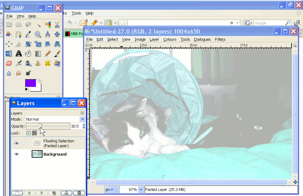
One great way of making this image subtle is to decrease the opacity of the layer. This works in relation to what is underneath the layer so, if the background underneath the layer is white, the image will be lighter, if it is white but with the word 'BEATBOXER' written in 'hot-pink' the image will become lighter except for the area over the text, which will become closer to 'hot-pink'. To change the opacity, go to 'Dialogues' 'Layers' and drag the slider or type in a number between one and one-hundred. You will be able to see the effect you are causing. You might want to use a picture of yourself to remind people that have your card. This could work as the backdrop or as a separate image somewhere else on the card.
To bring in an existing logo, go to 'File', 'Open' and locate the image. Paste this into the canvas containing the the text, move it to where you want, and anchor it down.
You will be moving parts from canvas to canvas but a lot of them are on white backgrounds that you will not want to transfer. You can make this background transparent by going to 'Colours', 'Colour to Alpha'. GIMP will then suggest that everything in your picture that is white becomes alpha. Click 'OK'. If part of the canvas, for example: your logo, contains white parts that you wish not to become transparent, there are a few ways you can tackle this. You can use the 'Bucket Fill' tool to put another colour into these parts, (preferably that stands out from the other colours). Once you have made white into alpha, you can fill these altered parts back up with white using the 'Bucket Fill' Tool. Alternatively, you can use the 'Fuzzy Select' tool to select these white parts. Hold down on the shift key to add separate parts to your current selection. When you have it all, you can copy it and then paste it back over the top on the new canvas.

Now you have three complete windows: The window containing the text and logo, the window containing the background and the window containing the backdrop. All you need to do to complete your card is to paste the images from canvas to canvas. Before doing this, in all canvas windows, go to 'File', 'Save As' and save them separately so that you can make adjustments easily if you change your mind or notice a problem in printing. Now just copy in paste at your discretion. You may wish to put the background over the backdrop or vice-versa. It all depends on your design.
In theory, you're done. In this finished canvas window Go to 'File', 'Save As' and save it as an XCF file (by just clicking 'OK'). Then do the same again but, before clicking 'OK', click the plus sign next to 'Select File Type (By Extension)' and select a format that will save it in a high quality and that will allow other programmes to access it (such as 'bmp' – a bitmap image). Saving in both of these formats will allow you to edit the file later as if you'd never closed it, (you can even still use the 'Undo' function), as well as bringing it to printing companies to get made into real cards.
Tips
- Try out things I haven't suggested and explore the programme – I obviously haven't described every GIMP function in this article; that would be a manual rather than a tutorial.
- Don't feel like you have to include everything I've described. Business cards work best when they are succinct. This gives the impression that you have a sense of quality control.
- Use gimp to perfect the image you plan to use as a backdrop, test out the opacity beforehand and compare it to the background and text.
- Get as many opinions on your card as you can before getting prints.
- Try to use contrast between the text and the background. Avoid having the letters over intricate detail that will make it harder to read.
- Get some draft versions printed on paper. Look at them in dim light such as night-time (where many people are likely to receive your card).
- Consider that people reading your card may have poorer eyesight than you. Make the text large enough for them.
- Try going to 'Colours', 'Invert' or 'Value Invert' or both in different orders. Do this at different stages in making your card. If all of these work well, it will be a fairly good sign that your colour scheme works well.
- Take breaks from making your card and come back to it with fresh eyes.
- Every time you give somebody a business card, ask for one back and vice-versa.
- Have more than you think you'll need printed and ready, even keep a supply at mates' houses so that you can stock up in different parts of town.
- If you have many different skills, it may be worth designing more than one business card.
- Make sure you card is thick enough to leave a good impression.
- Simple fonts are generally better.
- Save your work as you go making several different files, this way you can go back a few steps if you discover a mistake or if you information changes.
- Compare the differences in your business card to other cards of industry professionals.
- Consider whether you'll want to get them printed over the internet or directly from a shop. A shop will probably be more expensive but you'll be able to bring in examples of other cards to ensure you get the exact material you want.
- If there are glitches that disappear when you zoom in or out, don't worry; these will not show up on your prints.
- Leave around 3mm 'bleed' space around the edges.